Monday, 12 May 2014

Inspirational Model - Final Renders

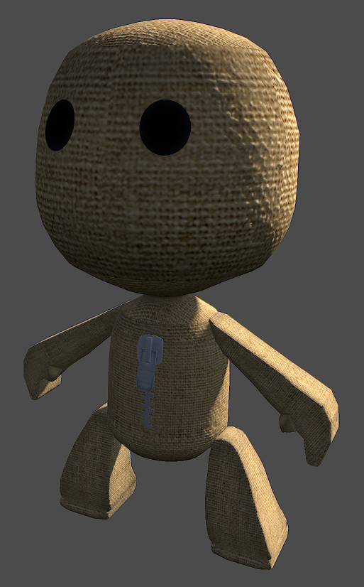
These are the final renders of the finished character.

In these renders you will see two different light effects that show the character in different ways.

Harsher Lighting:


These two renders show off the 'harsher' lighting choice that I created. This type of lighting helps to show the Specular map and Normal map that I created. 
The harsher lighting on the back of the character casts a darker shadow over the front face of the character, which, if you refer to my lighting blog earlier on is the effect I wanted to create.

Softer Lighting:


This softer creates the sense that the character is somewhere near a sunset. This type of lighting is softer that the others before; which creates a lighter hearted feeling about the character.


Inspirational Model - The First Renders (unlit)

These are rendered images of the character are from Marmoset. The lights haven't been placed into the scene yet.
One of the reasons why I decided to show these renders is because it will allow you to see the difference between a light scene and an unlit scene.


Inspirational Model - The Textures

My model will contain three different types of maps. The first being a Diffuse, second is Specular and the third and final map is a Normal.
The reason why I have chosen to use these three maps on my model is because, well, they are the more common types of maps available; there are other popular maps such as Bump, Alpha channel, Opacity, Reflection and Refraction.
I have chosen to use a Diffuse because, obviously, without it the character would have no colour or design. The Specular map allows me to create a more realistic feel to the character as I can control how light bounces off of the character in certain ways on certain areas. The Normal will, again, allow me to push the realistic feel and imagery of the character further, by using a Normal map, I can create the illusion that the sack weave is actually a weave and doesn't just look like a flat image. It also allows me to create engravings in the metal on the zip of the character.

Diffuse Maps:


These are the two Diffuse maps I created for the character (check UV post for why there is two). I wanted to go for a lighter colored weave for my characters fabric, rather than the more traditional and popular dark brown. I didn't want the character to look completely clean, because nothing in the real world is perfect (in the sense of undamaged). By creating the dark areas around where the stitching would be on each section it shows that a lot of strain goes on these areas as this is where the coloration of the character is rubbing and fading away.
I wanted to keep the eyes a traditional black, this is because nearly all sack boys have these types of eyes; to push the eyes further and bring more life into them then refer to the specular maps.


Specular Maps:


These are my two Specular maps for my character. The specular maps look fairly simple in design, however once lighting is incorporated into the scene with my character, I feel that this map will bring out and help to develop some of the details of the character.
When a light is directed at a sack weave, the cloth that the sack has been weaved in is relatively reflective, not in the sense that you can see your reflection or it will blind you if you look at it but you can the beams of light across the strands. By manipulating the levels of black and white I was able to pull back the inside sections and make the weaves whiter; this will create a realistic effect of the fabric I am trying to replicate with the character. 


Normal Maps:


These are my two Normal maps for my modeled character. The main reason why I wanted to use a Normal map on my character is because it will help me to push the detail in the sack weave. By manipulating the layout before converting it into a Normal map, it allows me to bring forward the individual weave strands and push back the ares between the strands. This creates the illusion that there is depth and perspective to the textures, rather there just being a flat texture placed over a model. 
To finish up the details I added and engraving on the character's zip. It's fairly simple in design, with there being a few lines and the letter 'YKK'. YKK is a zip brand that is seen on a lot of zips. When you look at the Diffuse map, you won't see the 'YKK' there; this is because I wanted to create the engraving illusion so therefore no extra colours go onto this section but as light passes over the zip section you will see the engravings. 


Friday, 9 May 2014

Inspirational Model - UV

Now that the modelling of the Inspirational Model is finished its time for me to move onto UV-ing the character so I can then advance onto texturing.
During the weekly sessions with the tutor we have looked into and used a few independent UV-ing softwares.
To UV my character I used Max's own software as I felt more comfortable and familiar with it than other independent softwares.

Here are my UV renders for my character:

I used two UV maps for my model because having two allowed me to put more detail into certain aspects of the model, without having to cram everything into one uv sheet.

First UV map:


This is the first UV map. I contain the head and body section. This is the reason why I used two maps instead of one; having two allows me to focus a lot of space within the UV map so therefore I can put more detail into these areas. The body and head are the bigger models and generally is where the focal point of the character is.

Second UV Map:


This is the second UV map. This map contains the other sections of the character; sections like the arms, legs, zip and zip teeth. You may notice that there is only one arm, one leg and one zip tooth UV'd. To save on UV space I have piled the UVs on top of one another. 
With the zip teeth I first modeled one, UV mapped it and then made copies of it; because models use the same UV layout when copied this allowed me to 'cheat' out more space.
With the arm and legs, once I had modeled one of each section, I then used a modifier within 3DS Max known as 'Mirror'. This allows you to copy the model and mirror it along a plane within the view port; X, Y, Z, XY. ZX and so on. 

Tuesday, 11 March 2014

Inspirational model - The model

Once I had finished modelling the body, arms, legs and zip of the character it was now time to start working on the face of the character.

Below are the screenshots of the character as it sits now:


Tuesday, 4 March 2014

Week 19 - Texture Tutorial

Over the past few weeks, both outside of the lesson and in the lessons with the tutor, we have been focusing on improving and working on the development of our Inspirational Model piece.

However, this week the tutor ran a tutorial session on texturing skills within Photoshop. This lesson was a massive help as we have other projects; like this one, that involves lots of texturing inside of Photoshop and working with UV's.

He began by uploading the files we needed for the tutorial to the shared folder on the computers, he then went through and showed up different techniques in painting an organic object.

Below are images taken from my work:


Here is the UV layout that the tutor gave us, our goal was to create a basic rock texture around this 'underwater' rock.


We then created a base rock texture for the object, we did this by duplicating the base texture and removing the seams between the materials.


We the started to add on detail to the surface of the rock. We used a porous material provided in the shared files. Once we had positioned the material where we wanted, we then changed the layer to 'soft light' to get that faded appeal, making the material look like it belongs. We then went through removing any hard edges left.


Once the porous texture was done it was then a case of creating the streaks seen at the bottom, the streaks were to simulate the effect that water takes on a rock over the years as it brushes past.

The process for the streaks was the same as the porous material.


This is the raw texture that I created during the tutorial without the UV's.


Tuesday, 25 February 2014

Inspirational Model Update - The Pinch Problem

As, now, I am pretty much finishing with the modelling process of my Inspirational Model, I am at the stage of doing final checks of the model, making sure the polys run smoothly and are creating what I actually want with this project.

Whilst I was checking the body of the model I noticed a strange 'pinching' effect towards the bottom, as illustrated in the screenshot below.


Not only does this not look appealing on the model but also I could affect the textures when I come to add them to the model, it could distort or stretch the textures; ruining the model.
I believe this is caused by the turbo smooth that I added to the model to create the smooth flowing polys.

To overcome this problem I began by deleting the 'Turbo smooth' modifier that was applied to the model. This instantly got rid of the pinch but the model now looked rough and low poly. I then tidied up the bottom part of the body by re- shaping the polys around that are. Once this had been taken care of I then went through the body section, applying smoothing groups to the surfaces, which created the same type of smoothness from the turbo smooth but didn't create that pinch effect at the bottom.

Below are images of the new and improved body of the Inspirational Model: